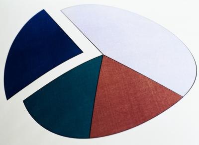
When your boss tasks you with a presentation mere hours before a meeting, you may be rushing to get the data into a usable chart. Color coding charts takes time, which you might not have to spare. Not to mention the time spent hunting down a color printer that has enough ink to properly produce your work. Instead of using the colors of the rainbow to differentiate your data, use shades of gray. From almost white to pure black, you can make your data stand out in your pie or bar charts.
Instructions
- 1Create your bar or pie chart according to the data you have. Use whatever software program you regularly use to create charts.
- 2Determine which shades of gray to use. Once your data have been converted into chart form, such as a pie chart or bar chart, you must decide what shades of gray to apply to each slice or bar. The gray scale tones range from zero percent black -- which leaves the area white -- to 100 percent black.
- 3Change your bars or pie slices to shades of gray. Start with zero percent and increase the tone by 10 to 20 percent with each piece of data, depending on how many you have to account for. For example, if you have six slices in a pie chart, set the grey tones to zero percent, 20 percent, 40 percent, 60 percent, 80 percent and 100 percent.
- 1


